METHOD STAIR SYSTEMS
Method Stair systems is a commercial stair company that aims to integrate industrial stair systems into new buildings and to create simple and straightforward designs so that builders and architects can incorporate the stairs into the initial planning rather than an afterthought. They gave me an example schematic of their work (below) and their color preferences, but other than that I had an essentially blank canvas as to what would best represent their company's image.
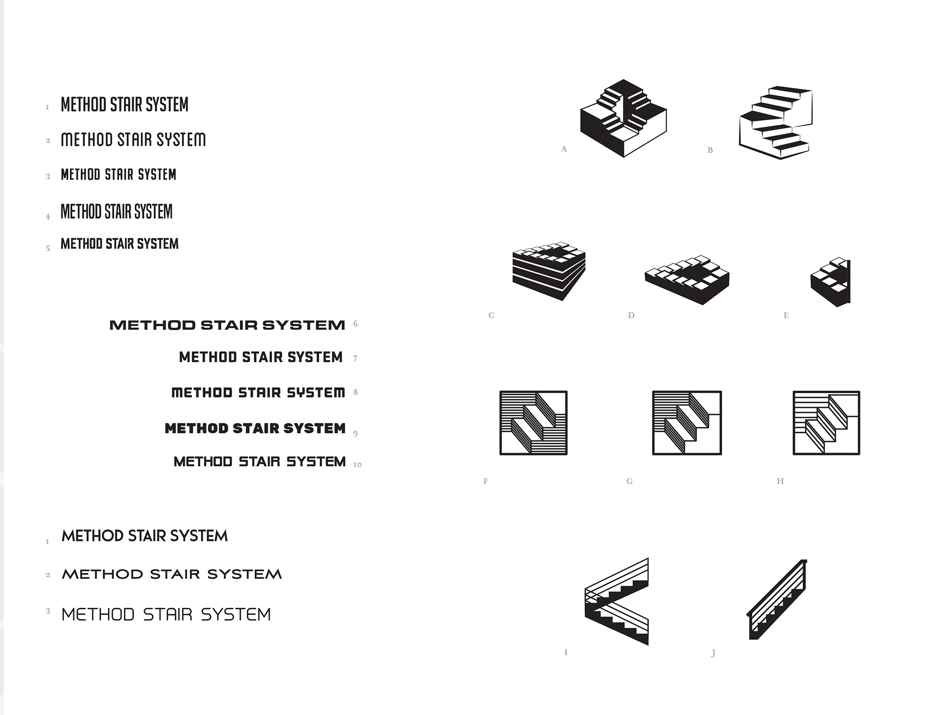
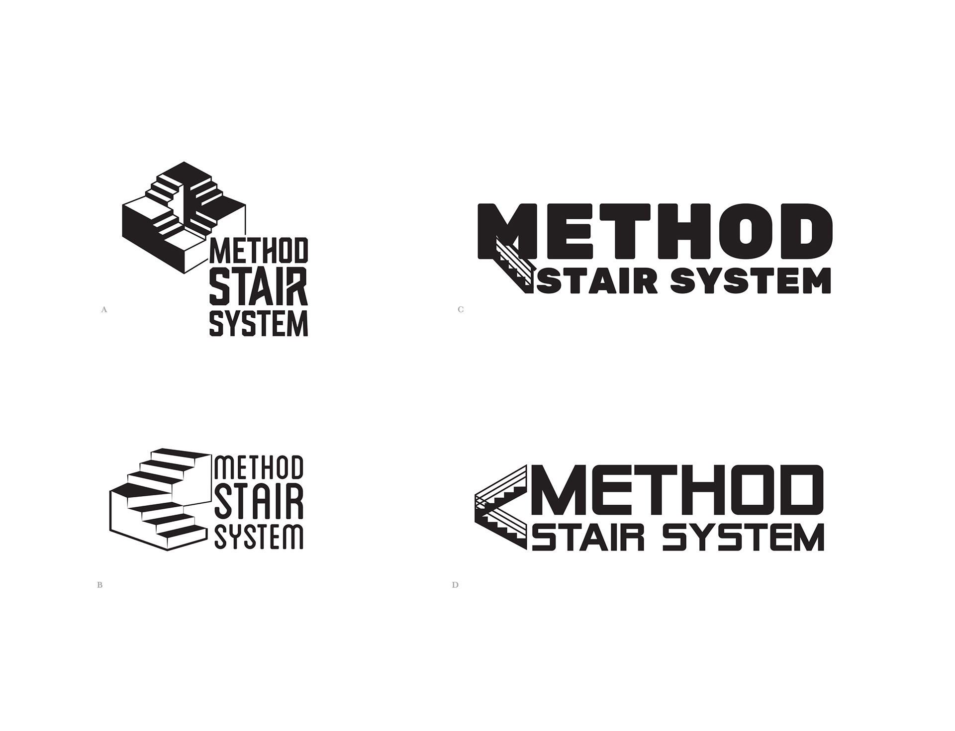
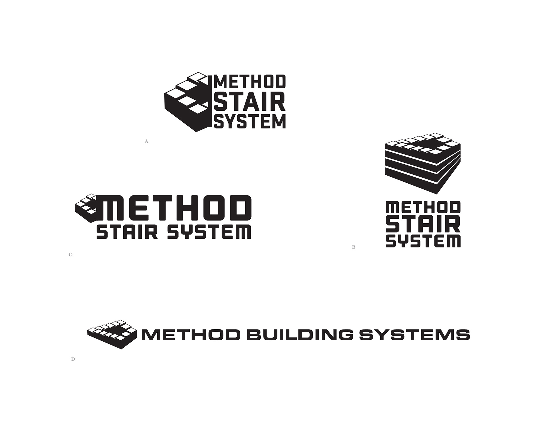
OPTIONS
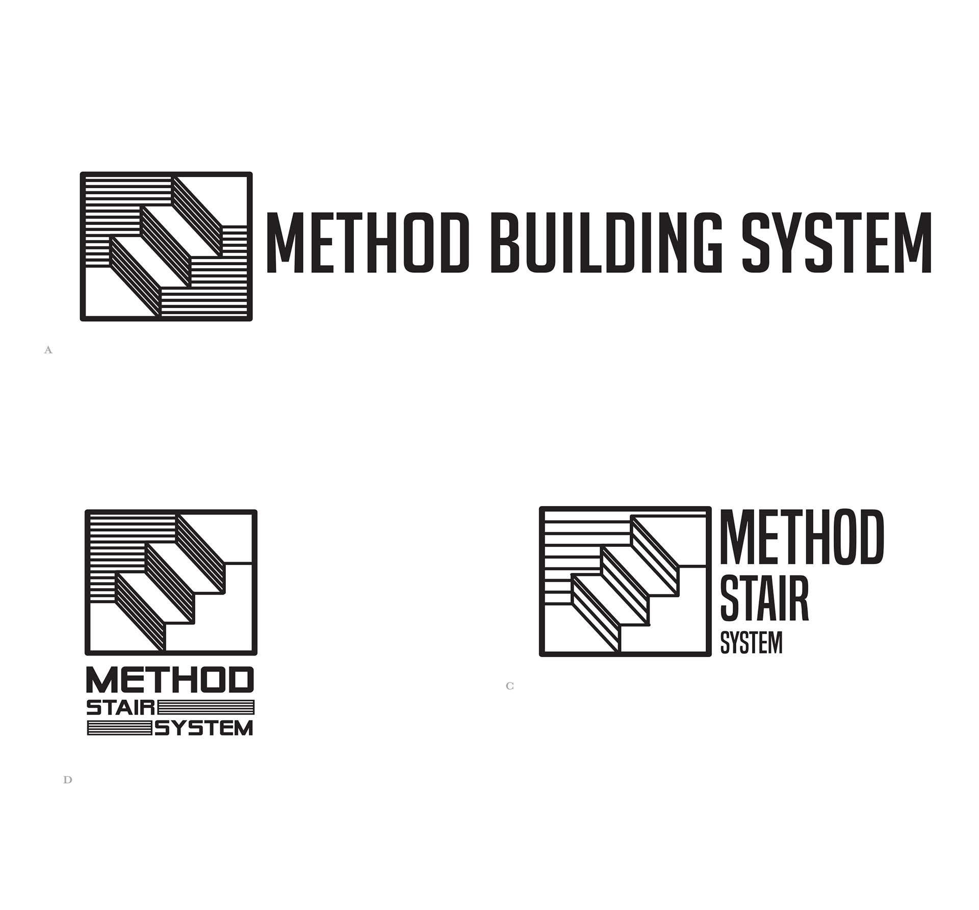
I wanted my key ideas to be of strength and reliability, so I went with bold, but simple sans serif typography. The stairs offered a unique opportunity to rethink the traditional iconography and go in a different direction. I created a few options that draw from MC Escher's infamous Penrose stairs, an illustration with creates the illusion of never-ending stairs. I wanted to offer some options with a traditional depiction of stairs, so I had it interact with the typography to create a fun visual.
FINAL DESIGN
I'd like to think that we decided upon an interesting option, that while being a more well-known depiction of stairs, still has texture and invites the eye to really follow the line work into the typographic portion of the logo.
We went with a monochromatic blue color scheme as well as the creation of a mini-branding kit that they can use including the color system, branding guidelines and the typography.
